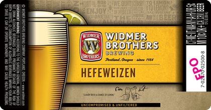
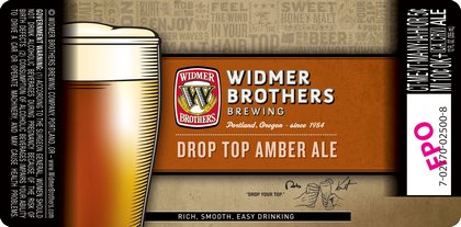
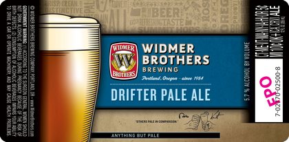
(Portland, OR) – New label approvals are in for Widmer Brothers.
The brewery got approval for three year-round beers: Widmer Hefeweizen, Widmer Drop Top and Widmer Drifter. Hefeweizen is one of the top-selling beers in the country among small brewers. Do you prefer uniform labels like this or miss the old unique designs?


They’re fine, but scrapping the cool Drifter label is a big loss.
My guess is that they want to signal they are a established, refined brewery and not just another hip yet unproven upstart? These labels are beyond boring and if they’re onto something then I fear that Craft Beer is headed toward macro-blandness, maybe not in flavor but surely in overall appeal. The transformation of our national beer culture, if not that of the world entire, needs to be about more than escaping adjunct ingredients and lager yeasts. Beer deserves conceptual appreciation on every perceivable level. These labels do not suggest that each beer is uniquely individual but rather that Widmer in general is sophisticated. Admirable if unmemorable. Beer is for the masses and we’re unaffected.
Pingback: Widmer Brothers adopt new, boring labels « Hop Heaven Homebrew
For some reason the DeadLift IPA label is one of my favorites and I would cringe in horror when this institutionalized format becomes the hallmark of their new bottles………….. the Hefe label fits the brew . … but like somebody else said, the new label for Drifter completely anonymizes the concept of the name . . .. to simplify what Im saying – “I THINK THIS IS A STUPID IDEA AND IT DUMBS DOWN THE PRODUCT”….. It reminds me of the labels on the store-brand soda that you buy at Wal-Mart……
Its like someone went into the office building of Widmer Brothers, chose the most unimaginative boring looking dope they could find, and forced him to design a label. I was so dissapointed after seeing these labels last night I couldn’t get myself to drink from the bottle.