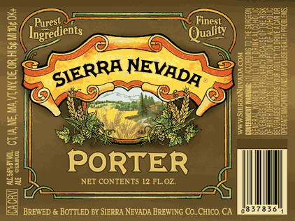
Administrative Note: I expect the January beer calendar update to happen this afternoon or tonight so check back again later!
(Chico, CA) – Yes, I have shown the above label here before but didn’t know the story until now. Here is the scoop via Sierra Nevada‘s Bill Manley: “All of the Sierra Nevada beers will be getting a new look, with a more slick and updated logo, including Pale Ale. The Pale Ale change is very subtle, but a change nonetheless. The new logo has an updated scene in the center circle, as well as more lush hops and barley “botanicals” around the outside. The botanicals will change on each new beer style, as will the center scene according to beer type. Porter and Stout (stout will release sometime later…probably May) will each have a new color package. Deep brown for the porter, dark sienna-orange for the stout, that we feel better represents the beer in the bottles. The current color scheme (light blue for porter and yellow for stout) don’t really offer any clues that these are dark, full-flavored beer… Also, they better match the new additions into our lineup. We also wanted to tell more of the Sierra Nevada story, so each beer has a unique story, speaking of brewery history and the origins of each beer. The copy blocks on the packaging lets our drinkers know a little more about who we are.”

